
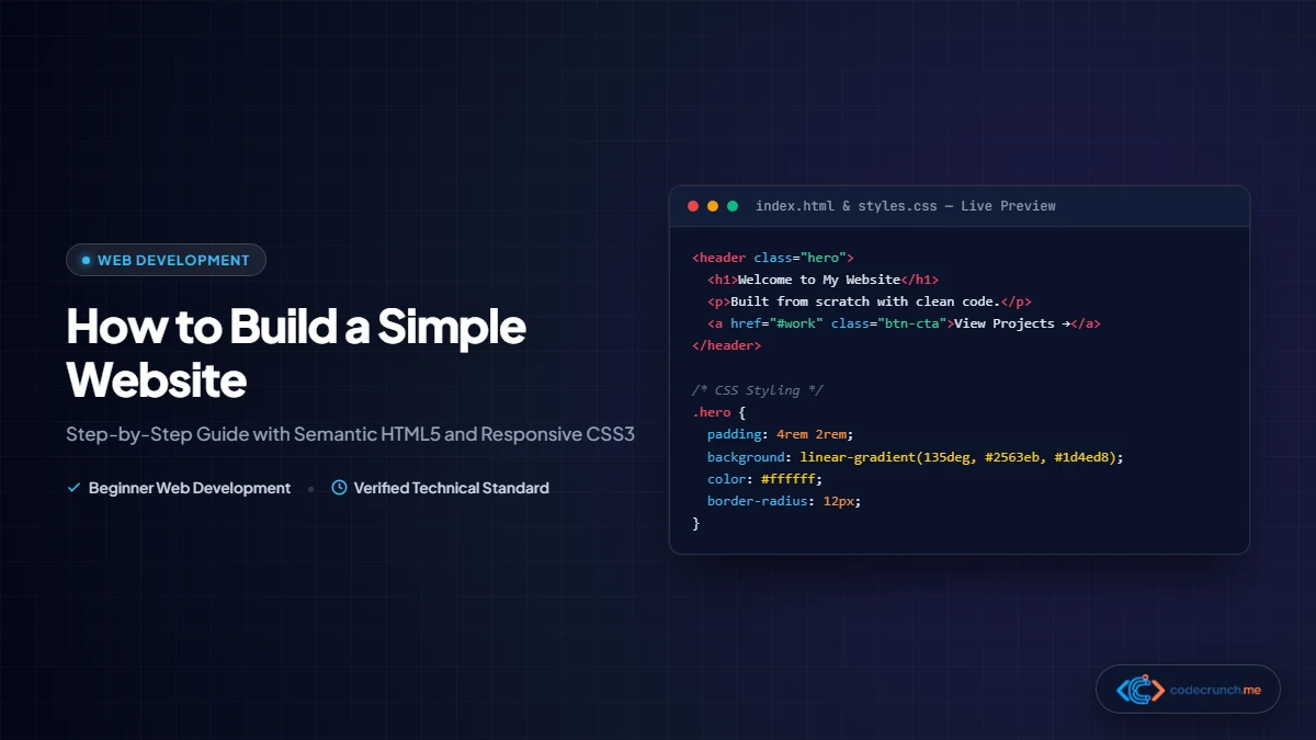
If you want to start web development, learning how to build a simple website using HTML and CSS is the single most rewarding first milestone. Every commercial website on the internet—from Wikipedia and Reddit to modern SaaS landing pages—is built upon these two foundational pillars.
You don’t need paid software, complex build systems, or expensive cloud servers to begin. All you need is a standard computer, a free code editor, and a browser. In this comprehensive step-by-step tutorial, we will build a modern, fully responsive multi-section landing page from complete scratch—featuring a hero masthead, navigation bar, responsive card grid, styled contact form, and free deployment guide in 2026.
Table of Contents
- 1. Prerequisites & Free Development Tools
- 2. Step 1: Project Folder and File Architecture
- 3. Step 2: Writing Semantic HTML5 Markup
- 4. Step 3: Global Styles, Reset, & Typography
- 5. Step 4: Building a Responsive 3-Card Grid with CSS Grid
- 6. Step 5: Styling an Accessible Contact Form
- 7. Step 6: Mobile Responsiveness with Media Queries
- 8. Step 7: Local Testing in Browser & DevTools
- 9. Step 8: Deploying Live to the Web for Free
- 10. Frequently Asked Questions (FAQ)

1. Prerequisites & Free Development Tools
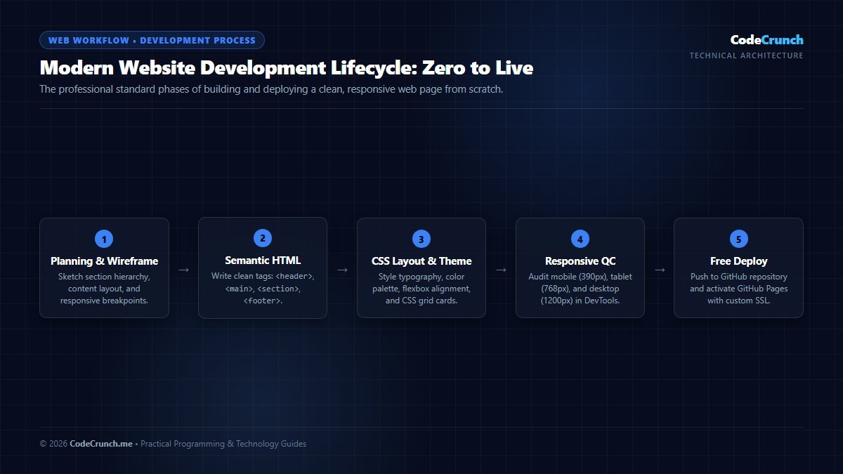
Full Development Lifecycle: Building a production-ready website follows an 8-stage sequence: Planning semantic hierarchy, building accessible HTML markup, configuring CSS resets, assembling responsive layouts, implementing forms, testing in DevTools, and deploying to global CDNs.
Web development is unique because all fundamental tools are 100% free and open:
- Code Editor: We recommend Visual Studio Code (VS Code). It provides syntax highlighting, auto-completion, and an integrated terminal.
- Live Server Extension: In VS Code, install the free “Live Server” extension by Ritwick Dey to automatically reload your browser whenever you save changes.
- Modern Web Browser: Google Chrome, Mozilla Firefox, Microsoft Edge, or Apple Safari.
2. Step 1: Project Folder and File Architecture
Clean file organization is the hallmark of professional developers. Follow these setup steps:
- Create a new folder on your Desktop or Documents directory named
my-first-website. - Open VS Code and drag the folder into the editor window (or use
File > Open Folder...). - Create two files inside the root of that folder:
index.html— The document structure, text, and assets.style.css— The layout rules, color palette, and responsive breakpoints.
3. Step 2: Writing Semantic HTML5 Markup
Open index.html and insert this clean semantic HTML5 markup. If you are unfamiliar with tags like <nav>, <main>, or <section>, consult our beginner guide to HTML tags explained for beginners:
<!DOCTYPE html>
<html lang="en">
<head>
<meta charset="UTF-8">
<meta name="viewport" content="width=device-width, initial-scale=1.0">
<title>Apex Tech Solutions — Modern Web Apps</title>
<link rel="stylesheet" href="style.css">
</head>
<body>
<!-- Primary Navigation -->
<header class="site-header">
<div class="container nav-wrapper">
<div class="logo">Apex<span>Tech</span></div>
<nav>
<ul class="nav-links">
<li><a href="#home">Home</a></li>
<li><a href="#services">Services</a></li>
<li><a href="#contact">Contact</a></li>
</ul>
</nav>
</div>
</header>
<!-- Hero Section -->
<section id="home" class="hero">
<div class="container hero-content">
<h1>Building Fast, Scalable Web Applications</h1>
<p>We transform complex software problems into elegant, responsive digital experiences built on modern web standards.</p>
<a href="#services" class="btn btn-primary">Explore Services</a>
</div>
</section>
<!-- Services Grid Section -->
<main class="container">
<section id="services" class="section-block">
<h2 class="section-title">Our Core Capabilities</h2>
<div class="grid-3">
<article class="card">
<h3>Frontend Engineering</h3>
<p>Interactive, responsive user interfaces constructed with semantic HTML5, modern CSS Grid, and vanilla JavaScript.</p>
</article>
<article class="card">
<h3>API Architecture</h3>
<p>Robust server microservices and RESTful API endpoints delivering secure database persistence.</p>
</article>
<article class="card">
<h3>Performance Auditing</h3>
<p>Optimizing asset payloads, Core Web Vitals, and caching layers for sub-second page loads worldwide.</p>
</article>
</div>
</section>
<!-- Contact Form Section -->
<section id="contact" class="section-block form-section">
<h2 class="section-title">Get in Touch</h2>
<form class="contact-form" action="#" method="POST">
<div class="form-group">
<label for="name">Full Name</label>
<input type="text" id="name" name="name" required placeholder="Alex Morgan">
</div>
<div class="form-group">
<label for="email">Email Address</label>
<input type="email" id="email" name="email" required placeholder="alex@example.com">
</div>
<div class="form-group">
<label for="message">Project Details</label>
<textarea id="message" name="message" rows="4" required placeholder="Tell us about your project..."></textarea>
</div>
<button type="submit" class="btn btn-primary">Send Message</button>
</form>
</section>
</main>
<!-- Footer -->
<footer class="site-footer">
<div class="container">
<p>© 2026 Apex Tech Solutions. Built with semantic HTML & CSS.</p>
</div>
</footer>
</body>
</html>4. Step 3: Global Styles, Reset, & Typography
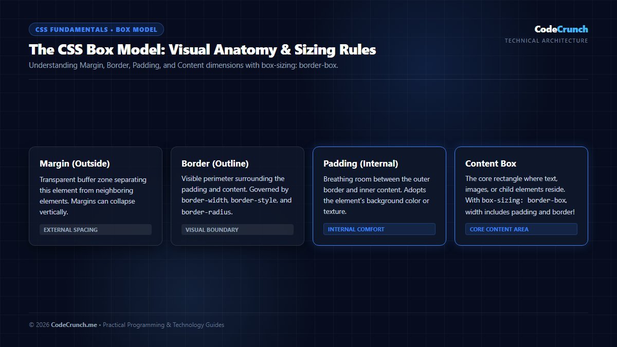
Visual Box Model Breakdown: Every rendered HTML element is a box composed of Content, Padding, Border, and Margin. Setting box-sizing: border-box globally ensures that padding and borders are calculated inside your specified width and height, preventing unexpected horizontal scrolling.
The Mandatory Global CSS Reset for Modern Web Design
Every web browser (Chrome, Safari, Firefox, Edge) applies its own default user-agent stylesheet with arbitrary margins, paddings, and font sizes. To ensure identical rendering across all devices, include this professional modern CSS reset at the very top of your style.css file:
/* Modern CSS Reset - CodeCrunch Standard */
*, *::before, *::after {
  box-sizing: border-box;
  margin: 0;
  padding: 0;
}

body {
  line-height: 1.6;
  -webkit-font-smoothing: antialiased;
  font-family: system-ui, -apple-system, BlinkMacSystemFont, "Segoe UI", Roboto, sans-serif;
  color: #1e293b;
  background-color: #f8fafc;
}

img, picture, video, canvas, svg {
  display: block;
  max-width: 100%;
  height: auto;
}

input, button, textarea, select {
  font: inherit;
}
By establishing predictable box-sizing and resetting default margins, your layout calculations remain clean and stable. For official CSS specifications, refer to W3C CSS Box Model Module Level 3 and MDN CSS Box Model Guide.
Now open style.css. We start by applying a modern CSS box-sizing reset, CSS custom properties (variables), and clean typography. To understand how class and element selectors work, review our guide on CSS selectors made simple:
/* 1. Global Reset & Variables */
:root {
  --primary: #2563eb;
  --primary-hover: #1d4ed8;
  --dark: #0f172a;
  --slate: #334155;
  --light-bg: #f8fafc;
  --white: #ffffff;
  --border: #e2e8f0;
}

* {
  box-sizing: border-box;
  margin: 0;
  padding: 0;
}

body {
  font-family: -apple-system, BlinkMacSystemFont, "Segoe UI", Roboto, Helvetica, Arial, sans-serif;
  color: var(--slate);
  background-color: var(--light-bg);
  line-height: 1.6;
}

.container {
  max-width: 1100px;
  margin: 0 auto;
  padding: 0 20px;
}

/* 2. Header & Navigation */
.site-header {
  background-color: var(--white);
  border-bottom: 1px solid var(--border);
  position: sticky;
  top: 0;
  z-index: 100;
}

.nav-wrapper {
  display: flex;
  justify-content: space-between;
  align-items: center;
  height: 70px;
}

.logo {
  font-size: 1.4rem;
  font-weight: 800;
  color: var(--dark);
}

.logo span {
  color: var(--primary);
}

.nav-links {
  list-style: none;
  display: flex;
  gap: 24px;
}

.nav-links a {
  text-decoration: none;
  color: var(--slate);
  font-weight: 600;
  transition: color 0.2s ease;
}

.nav-links a:hover {
  color: var(--primary);
}

/* 3. Hero Section */
.hero {
  background: linear-gradient(135deg, #0f172a 0%, #1e293b 100%);
  color: var(--white);
  padding: 80px 0;
  text-align: center;
}

.hero-content h1 {
  font-size: 2.75rem;
  font-weight: 800;
  margin-bottom: 16px;
  line-height: 1.2;
}

.hero-content p {
  font-size: 1.2rem;
  color: #94a3b8;
  max-width: 700px;
  margin: 0 auto 28px;
}

.btn {
  display: inline-block;
  padding: 12px 28px;
  font-size: 1rem;
  font-weight: 600;
  border-radius: 6px;
  text-decoration: none;
  border: none;
  cursor: pointer;
  transition: all 0.2s ease;
}

.btn-primary {
  background-color: var(--primary);
  color: var(--white);
}

.btn-primary:hover {
  background-color: var(--primary-hover);
}
5. Step 4: Building a Responsive 3-Card Grid with CSS Grid
Modern CSS Grid allows you to build responsive card layouts without calculating float widths or using bulky CSS frameworks:
/* 4. Section Blocks & Cards Grid */
.section-block {
  padding: 60px 0;
}

.section-title {
  text-align: center;
  font-size: 2rem;
  color: var(--dark);
  margin-bottom: 40px;
}

.grid-3 {
  display: grid;
  grid-template-columns: repeat(3, 1fr);
  gap: 24px;
}

.card {
  background: var(--white);
  border: 1px solid var(--border);
  border-radius: 8px;
  padding: 30px;
  box-shadow: 0 4px 6px -1px rgba(0, 0, 0, 0.05);
  transition: transform 0.2s ease, box-shadow 0.2s ease;
}

.card:hover {
  transform: translateY(-4px);
  box-shadow: 0 10px 15px -3px rgba(0, 0, 0, 0.1);
}

.card h3 {
  color: var(--dark);
  font-size: 1.25rem;
  margin-bottom: 12px;
}
6. Step 5: Styling an Accessible Contact Form
Forms must look attractive and remain accessible across all screen sizes:
/* 5. Contact Form */
.form-section {
  background-color: var(--white);
  border-radius: 8px;
  border: 1px solid var(--border);
  padding: 40px;
  margin-bottom: 60px;
}

.contact-form {
  max-width: 600px;
  margin: 0 auto;
}

.form-group {
  margin-bottom: 20px;
}

.form-group label {
  display: block;
  font-weight: 600;
  margin-bottom: 6px;
  color: var(--dark);
}

.form-group input,
.form-group textarea {
  width: 100%;
  padding: 12px;
  border: 1px solid var(--border);
  border-radius: 6px;
  font-size: 1rem;
  font-family: inherit;
  transition: border-color 0.2s ease;
}

.form-group input:focus,
.form-group textarea:focus {
  outline: none;
  border-color: var(--primary);
  box-shadow: 0 0 0 3px rgba(37, 99, 235, 0.15);
}

/* 6. Footer */
.site-footer {
  background-color: var(--dark);
  color: #94a3b8;
  padding: 30px 0;
  text-align: center;
  font-size: 0.95rem;
}
7. Step 6: Mobile Responsiveness with Media Queries
According to global web analytics benchmarks from StatCounter, mobile devices account for over half of all web traffic worldwide. We use CSS media queries to stack the navigation links vertically, adjust the hero typography, and change the 3-column card grid to a single column on mobile devices:
/* 7. Mobile Responsive Breakpoints */
@media (max-width: 768px) {
  .hero-content h1 {
    font-size: 2rem;
  }

  .grid-3 {
    grid-template-columns: 1fr;
    gap: 16px;
  }

  .form-section {
    padding: 24px;
  }
}
8. Step 7: Local Testing in Browser & DevTools
To view your website:
- In VS Code, right-click anywhere inside
index.htmland click Open with Live Server (or double-click the file in Windows File Explorer). - Press
F12(orCtrl+Shift+I) to open Chrome DevTools. - Click the Device Toggle icon (
Ctrl+Shift+M) to emulate an iPhone 14 (390px) and an iPad (768px) to verify that cards stack smoothly and text remains legible.
9. Step 8: Deploying Live to the Web for Free
Once you are happy with your site, you can publish it to the internet for free in less than two minutes using one of these trusted platforms:
- GitHub Pages: Push your code to a public repository on GitHub, go to Settings > Pages, and select your
mainbranch. Your site will be live atusername.github.io/my-first-website/. - Netlify Drop: Go to netlify.com, drag your project folder directly into the browser, and receive an instant live HTTPS URL.
- Cloudflare Pages: Connect your Git repository for free edge CDN hosting with unlimited bandwidth.
To understand the full network journey of how users connect to your deployed site, read our deep-dive on how websites work step-by-step. To add dynamic interactivity like click counters or modals, explore our primer on JavaScript variables explained easily, and review the broader career requirements in our guide on frontend developer skills in 2026.
10. Frequently Asked Questions (FAQ)
Can I build a commercial website without using WordPress or React?
Yes. Millions of high-speed corporate marketing pages, portfolios, and documentation hubs are built purely with vanilla HTML and CSS. They load instantaneously, require zero database maintenance, and cannot be hacked through plugin exploits.
Why is my CSS stylesheet not styling my HTML?
Check the <link rel="stylesheet" href="style.css"> path in your <head>. If style.css is inside a folder named css/, the path must be css/style.css. Also verify that the filename spelling matches case-sensitively.
How do I make my website show up on Google search?
Submit your live URL and XML sitemap to Google Search Console, use descriptive semantic tags (<h1>, <title>, <meta name="description">), and ensure your page loads quickly on mobile devices.