
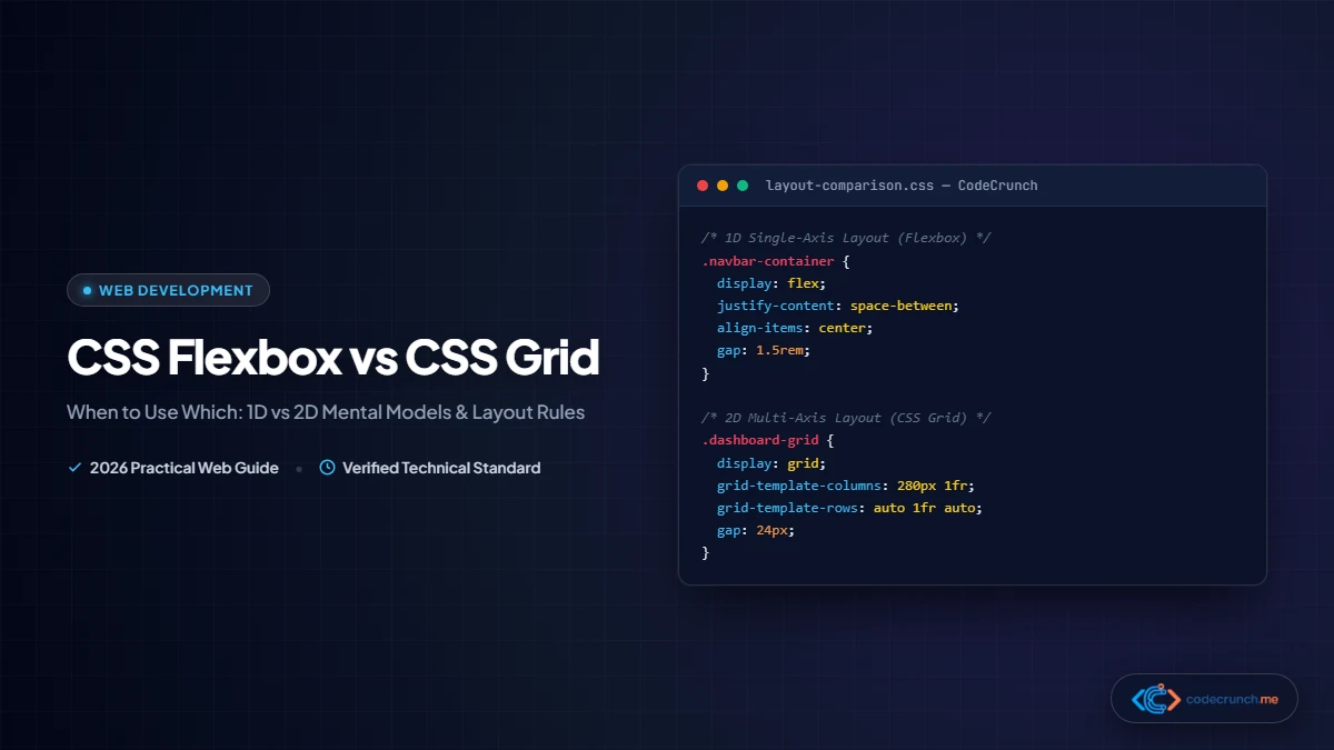
For years, web developers wrestled with hacky CSS layout techniques: table layouts, floats with clearfix hacks, and tricky inline-block spacing bugs. Modern CSS changed all that with two purpose-built, native layout systems: CSS Flexbox (Flexible Box Layout) and CSS Grid Layout.
Yet for newcomers and experienced developers alike, a persistent dilemma remains: When should I use Flexbox, and when should I reach for CSS Grid? The answer is not about picking one over the other; rather, it is about understanding their dimensional superpowers and combining them harmoniously.
In this comprehensive guide, we unpack the fundamental mental models of both systems, examine concrete code examples, and establish clear rules for choosing the right tool for every responsive interface requirement in 2026.
- CSS Flexbox is One-Dimensional (1D): Designed to arrange items along a single axis at a time—either in a horizontal row or a vertical column. It is content-driven.
- CSS Grid is Two-Dimensional (2D): Designed to arrange items across rows and columns simultaneously. It is container-driven.
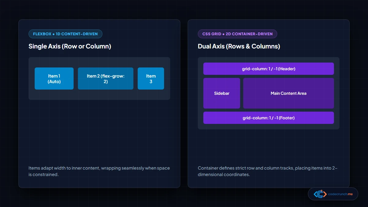
Flexbox vs. Grid: Head-to-Head Comparison Matrix
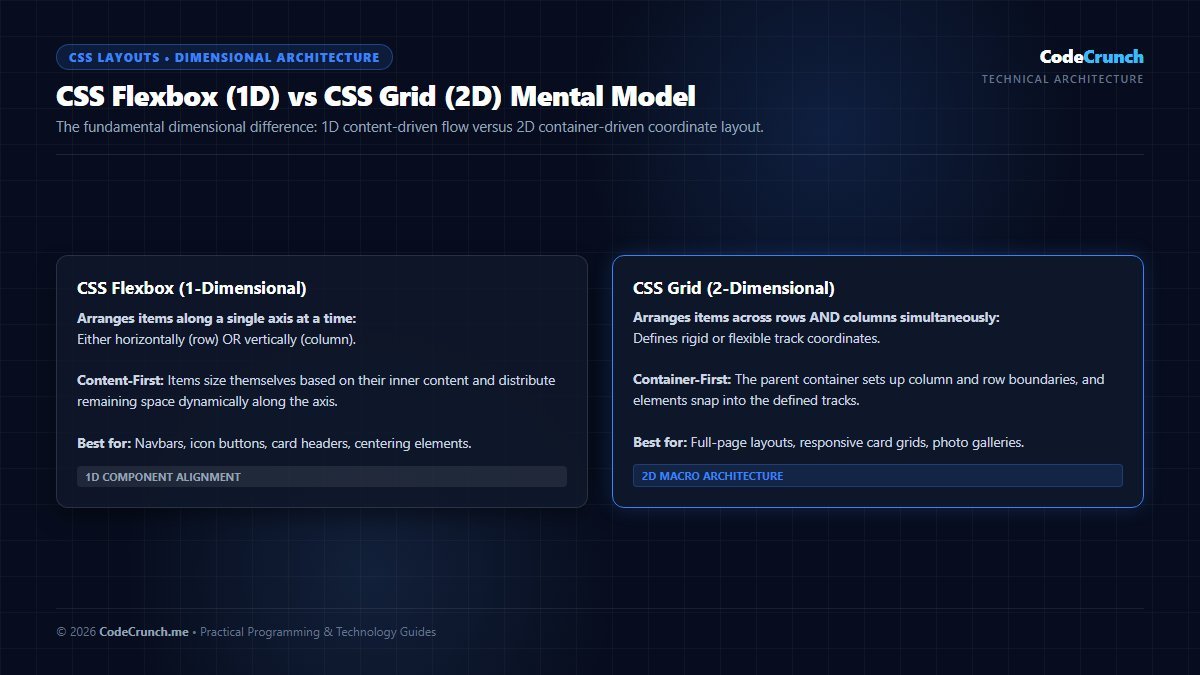
Mental Model Comparison: CSS Flexbox is fundamentally one-dimensional, designed to calculate dynamic flow along a single axis (either row or column). CSS Grid is two-dimensional, aligning items simultaneously across rows and columns into distinct grid tracks.
Use this reference table to evaluate layout requirements instantly:
| Design Requirement | Recommended Tool | Why This Tool Wins |
|---|---|---|
| Navigation Bar | CSS Flexbox | Items flow linearly along a single horizontal axis with space distribution. |
| Full Page Website Layout | CSS Grid | Coordinates header, sidebar, main content, and footer in a 2D layout. |
| Responsive Card Grid | CSS Grid | repeat(auto-fit, minmax(280px, 1fr)) creates auto-wrapping grids with zero media queries. |
| Inside a Single Card | CSS Flexbox | Vertically stacks title, excerpt, and pushes the “Read More” button to the bottom. |
| Centering an Item in a Box | Either (Flex or Grid) | Both achieve perfect centering in two lines of CSS (place-items: center or justify/align). |
| Overlapping Elements / Banners | CSS Grid | Allows grid items to occupy overlapping grid track lines without absolute positioning. |
| Button Group / Form Controls | CSS Flexbox | Dynamically scales button widths based on text label lengths. |
| Image / Photo Gallery | CSS Grid | Rigid rows and columns ensure cards align horizontally and vertically. |
Part 1: Mastering CSS Flexbox (1D Layout)
Flexbox works on a parent-child relationship. You declare display: flex on the parent container, and its immediate children instantly become flex items flowing along a primary axis.
Understanding the Axes
- Main Axis: The direction in which flex items are laid out. Governed by
flex-direction: row(default, left-to-right) orflex-direction: column(top-to-bottom). Alignment along this axis is controlled byjustify-content. - Cross Axis: Perpendicular to the main axis. Alignment across this axis is controlled by
align-items.
/* Classic Responsive Navbar */
.site-header {
  display: flex;
  justify-content: space-between; /* Pushes logo left, navigation right */
  align-items: center;          /* Centers items vertically */
  padding: 16px 24px;
  background-color: #0b1329;
}

.nav-links {
  display: flex;
  gap: 20px;                    /* Clean spacing between link items */
  list-style: none;
}
Why Flexbox Excels at Single-Direction Alignment
In our tutorial on CSS selectors and practical styles, we discuss component modularity. Flexbox is content-first: items size themselves according to their internal content (such as a variable-length text label) and distribute leftover space dynamically.
.container {
  display: flex;
  justify-content: center; /* Horizontally center */
  align-items: center;     /* Vertically center */
  min-height: 100vh;
}
Part 2: Mastering CSS Grid (2D Layout)
CSS Grid is an architectural, container-first layout engine. Instead of letting content determine where items fall, you first define a rigid or responsive grid of rows and columns on the parent container, and elements snap into the defined grid tracks.
The Magic of repeat(), minmax(), and auto-fit
The single most powerful CSS Grid feature for web developers is the responsive auto-fitting grid. It completely eliminates the need for clunky media queries across mobile, tablet, and desktop screens:
.article-grid {
  display: grid;
  /* Automatically calculate columns: minimum 280px, maximum 1 fraction of space */
  grid-template-columns: repeat(auto-fit, minmax(280px, 1fr));
  gap: 24px;
}
How this works in practice:
- On a mobile phone (390px wide), only one column can fit above 280px, rendering a 1-column layout.
- On a tablet (768px wide), two 280px columns fit comfortably, rendering a 2-column layout.
- On a desktop (1200px wide), three or four columns fit seamlessly, scaling up equally via the
1frfraction unit.
Semantic Page Architecture with grid-template-areas
CSS Grid enables you to name areas of your page like an ASCII schematic:
.app-layout {
  display: grid;
  grid-template-columns: 260px 1fr;
  grid-template-rows: auto 1fr auto;
  grid-template-areas:
    "header  header"
    "sidebar main"
    "footer  footer";
  min-height: 100vh;
}

.site-header  { grid-area: header; }
.site-sidebar { grid-area: sidebar; }
.site-main    { grid-area: main; }
.site-footer  { grid-area: footer; }
To see how semantic HTML structure pairs with this layout, review our guide on HTML tags every beginner must know.
The Hybrid Approach: Combining Flexbox and Grid
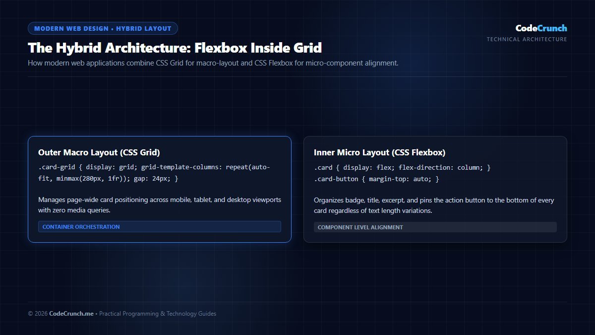
The Modern Hybrid Layout Pattern: Professional web engineering does not choose between Flexbox and Grid. As shown in the architectural pattern above, CSS Grid handles the macro-layout (page wrapper, sidebars, responsive card columns), while CSS Flexbox manages the micro-layout inside individual components (header navigation items, card footers, avatar badges).
The Holy Grail of Responsive Card Grids Without Media Queries
One of the most powerful features of CSS Grid is the ability to create fully responsive, auto-wrapping card layouts without writing a single media query breakpoint. By combining repeat(), auto-fit, and the minmax() function, the browser automatically calculates the ideal column count based on available viewport width:
/* Responsive 3-to-1 Column Card Grid Without Breakpoints */
.card-grid {
  display: grid;
  grid-template-columns: repeat(auto-fit, minmax(300px, 1fr));
  gap: 24px;
}

.card {
  display: flex;
  flex-direction: column;
  justify-content: space-between;
  padding: 20px;
  background-color: #ffffff;
  border-radius: 8px;
  box-shadow: 0 2px 8px rgba(0, 0, 0, 0.06);
}
In this architecture, each card is guaranteed a minimum width of 300px. If three 300px cards (plus gaps) fit on screen, three columns are created. As the screen shrinks to tablet or mobile widths, columns gracefully drop to two, and then one, expanding smoothly via 1fr to fill available horizontal space.
For authoritative specification documents, see the W3C CSS Flexible Box Layout Module Level 1, the W3C CSS Grid Layout Module Level 2, and MDN CSS Layout Essentials.
In modern web development, the question is never Flexbox vs. Grid; it is Flexbox inside Grid. Modern production websites use CSS Grid for outer structural macro-layouts and CSS Flexbox for inner micro-components.
<!-- Outer Macro Layout: Managed by CSS Grid -->
<div class="card-grid">
<!-- Individual Card: Managed internally by Flexbox -->
<article class="card">
<img src="laptop-guide.jpg" alt="Laptop Guide" class="card-image">
<div class="card-content">
<span class="badge">Hardware</span>
<h3>Laptop Buying Guide for Developers</h3>
<p>Essential specifications for modern development.</p>
<a href="#" class="read-more-btn">Read Full Article →</a>
</div>
</article>
</div>
And the supporting CSS:
/* 1. Macro Grid: Organizes the card collection across the page */
.card-grid {
  display: grid;
  grid-template-columns: repeat(auto-fit, minmax(300px, 1fr));
  gap: 32px;
}

/* 2. Micro Flex: Organizes content inside each individual card */
.card {
  display: flex;
  flex-direction: column;
  border-radius: 8px;
  overflow: hidden;
  background: #ffffff;
  border: 1px solid #e2e8f0;
}

.card-content {
  display: flex;
  flex-direction: column;
  flex-grow: 1; /* Fills remaining vertical card space */
  padding: 20px;
}

/* Push the button to the bottom of every card regardless of excerpt length! */
.read-more-btn {
  margin-top: auto;
  align-self: flex-start;
}
Common Layout Mistakes to Avoid
- Trying to force Flexbox into a 2D multi-row grid: While
flex-wrap: wrapallows items to wrap, items on the final row will stretch awkwardly to fill remaining space rather than aligning strictly beneath the columns above. For multi-row grids, always use CSS Grid. - Using CSS Grid for simple linear rows: If you only need three icons or buttons in a line, creating a grid with column declarations is unnecessarily verbose. Use Flexbox.
- Neglecting the
gapproperty: Both Flexbox and CSS Grid natively supportgap,row-gap, andcolumn-gap. Never resort to legacy margin hacks (such asmargin-right: 15pxwith:last-child { margin-right: 0; }).
Frequently Asked Questions (FAQ)
Does CSS Grid replace CSS Flexbox?
No. CSS Grid was never intended to replace Flexbox. They were engineered by the W3C CSS Working Group as complementary specifications. Grid handles two-dimensional structural positioning across rows and columns, while Flexbox handles one-dimensional distribution and component alignment.
Do CSS Flexbox and CSS Grid work across all modern web browsers?
Yes. Both CSS Flexbox and CSS Grid have universal, 100% browser support across Google Chrome, Apple Safari, Mozilla Firefox, Microsoft Edge, and all modern mobile browsers. You can deploy both without vendor prefixes or polyfills in 2026.
What is the difference between auto-fit and auto-fill in CSS Grid?
When there are fewer items than available column slots, auto-fill creates empty phantom tracks to fill the container width, keeping your cards at their minimum specified width. auto-fit collapses empty tracks to zero width and expands the existing cards to stretch across the full available container width.
Build Real-World Layouts with Confidence
Mastering layout architecture unlocks your ability to transform design mockups into polished, responsive user interfaces. To practice your layout skills on complete websites, explore our step-by-step tutorial on how to build a website from scratch and follow our structured frontend developer roadmap.